Stellar Bank
See full project ↗
Stellar Bank is a relationship-focused community bank serving the Greater Houston area.
Stellar Bank is the merged entity of Allegiance Bank and Community Bank of Texas. We created a comprehensive brand identity that balanced professionalism and warmth and encompassed many touchpoints ranging from print, signage digital, motion, art direction, illustration, and more. We worked with strategist and writer, Scott Redepenning, who developed a brand platform and strategy to position the company and allow it's values to shine through every interaction.
To "Be Stellar" means access to expert bankers to guide your financial journey, the locations and online tools you need to bank your way, and a deep commitment to local people and businesses.
BRAND STRATEGY
Scott Redepenning


The Plant Second Ward
See full project ↗
The Plant in Second Ward is a dynamic corridor of small businesses and community spaces rooted in the heart of Houston’s historic East End. We developed a modular and approachable identity that reflects their mission to honor the neighborhood’s heritage while fostering growth and connectivity.
Through placemaking and progressive urbanism, The Plant balances expansion with preservation, offering a culturally and physically connected experience. Our work extended across branding, wayfinding, marketing collateral, and a digital experience, emphasizing the neighborhood’s welcoming, multi-faceted character and its role as a hub for creativity and community.


MFAH Core Program
See full project ↗
The Core Program at the Glassell School of Art at the Museum of Fine Arts, Houston, is a prestigious residency that allows residents to engage with a wide range of leading artists, critics, curators, and scholars.
We created a gallery book and various print, digital, and physical touchpoints for the 2023–2024 term and Core Program Exhibition.


Timber Pictures
See full project ↗
Timber Pictures is a full-service video production and creative partner that brings ambitious visions into reality. By using a collaborative storytelling approach, their dynamic creative teams deliver unique perspective to every opportunity.
We worked with strategist, Garrett Herzik, to develop a brand platform alongside a comprehensive brand identity guidelines system and digital experience. Located in a historic building in downtown Houston, the Timber Pictures office carried brand elements throughout the space highlighting interior and exterior touchpoints.


Cafe Louie
See full project ↗
Layers upon layers in a space inspired by the work of Luis Barragán. With an expansive offering, Cafe Louie served up rustic and inventive pastries, better-than-your-momma-made breakfast, lunch and dinner, premium locally roasted coffee and tea, and carefully selected draft beer and wine.
We created a vibrant, enticing brand system that covered experiential, digital, print, and various environmental touchpoints. Inspired by the juxtaposition of soft dough and the modular bricks throughout the interior, we developed a custom modular wordmark and created a monospaced headline typeface dubbed, Louie Mono. Referencing the numerous layers of pastry dough–we carried the idea of layering throughout many touchpoints of the identity such as the menu, pattern, and messaging. Cafe Louie has since closed to the public but remain bakery artisans for wholesale customers and local pop-ups.
FABRICATION/SIGNAGE
rootlab
PHOTOGRAPHY
Logan Sebastian Beck & Alexander Beck
SIGNPAINTING/MURAL
Margaret Braun


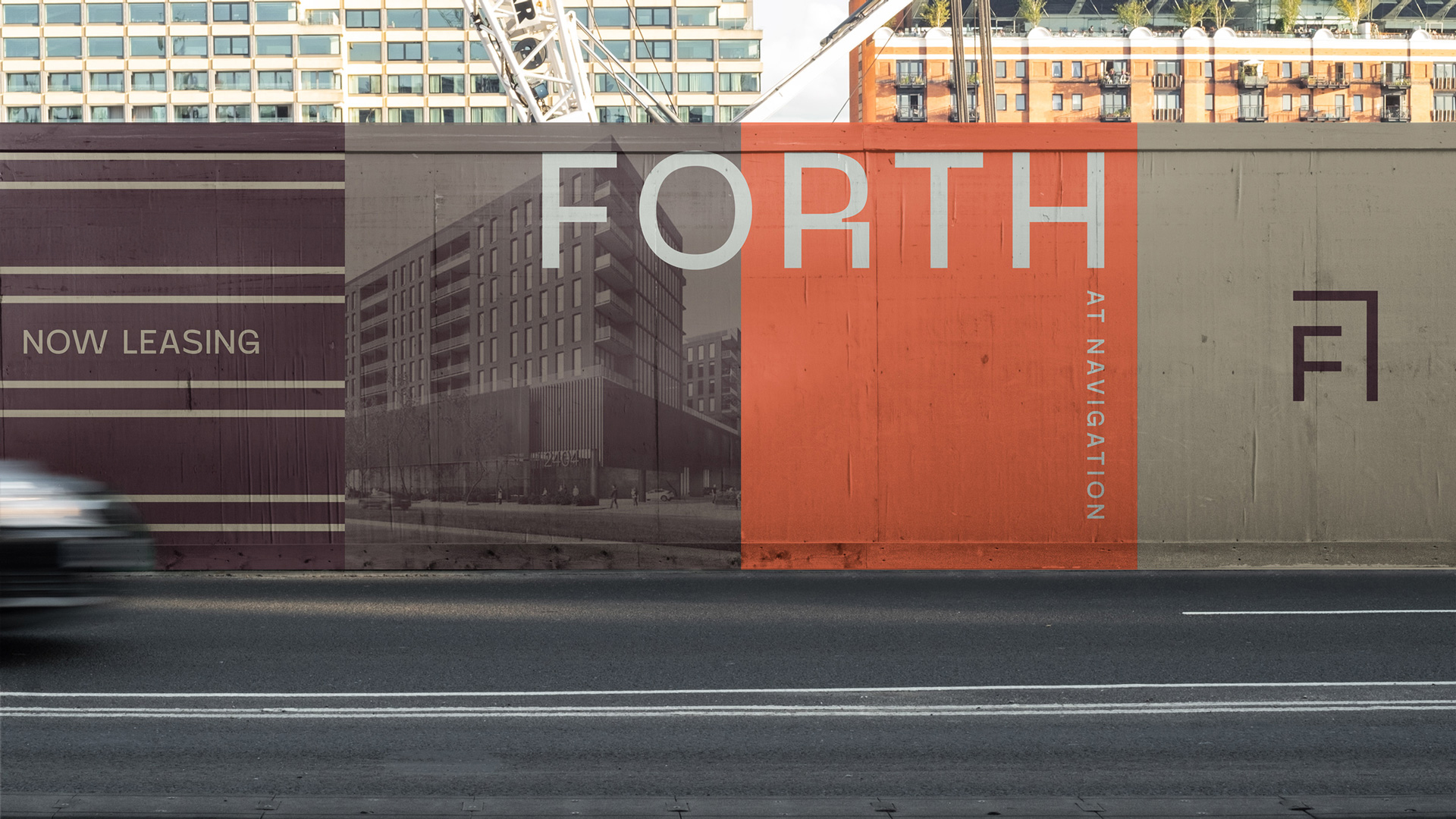
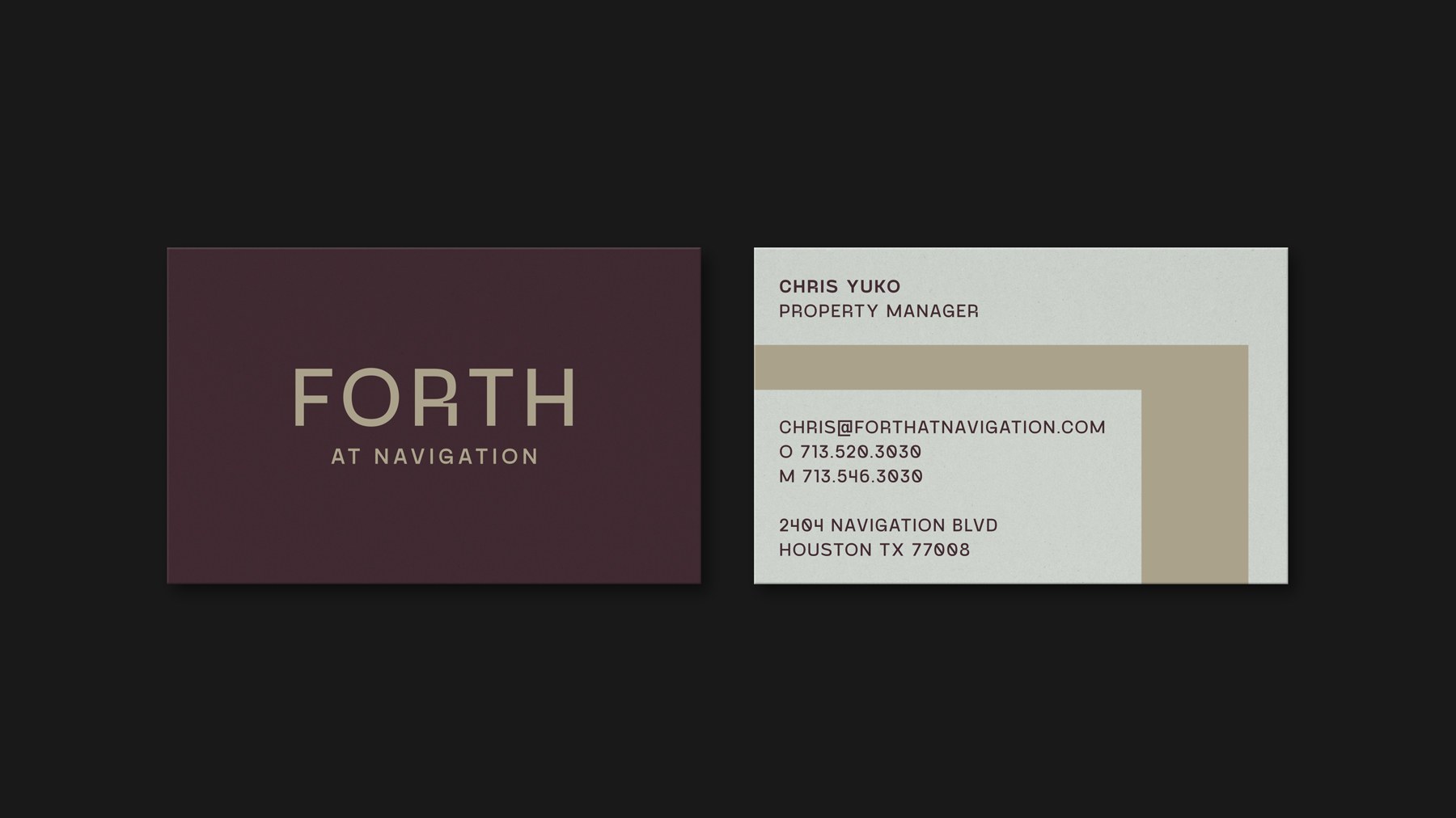
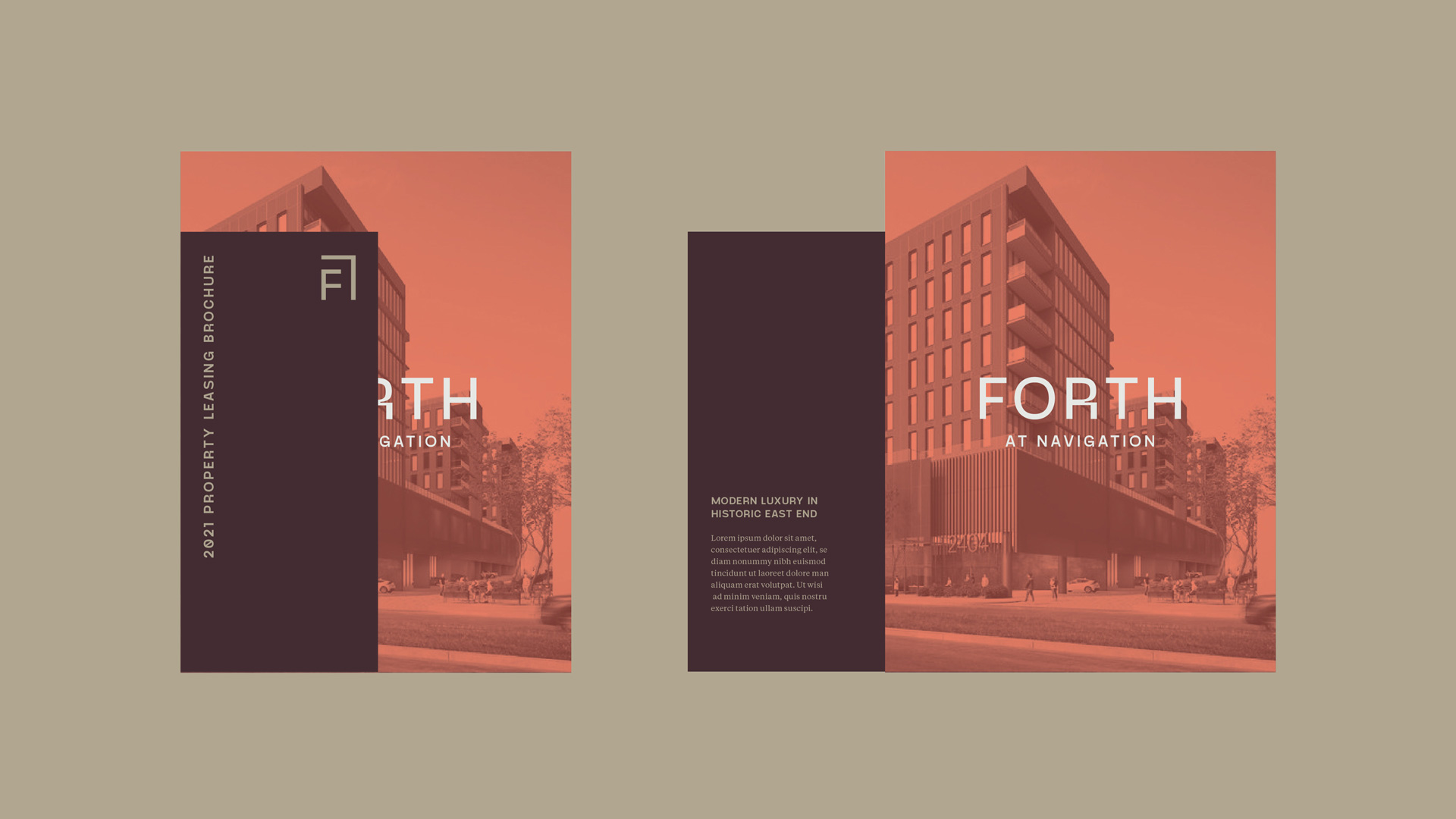
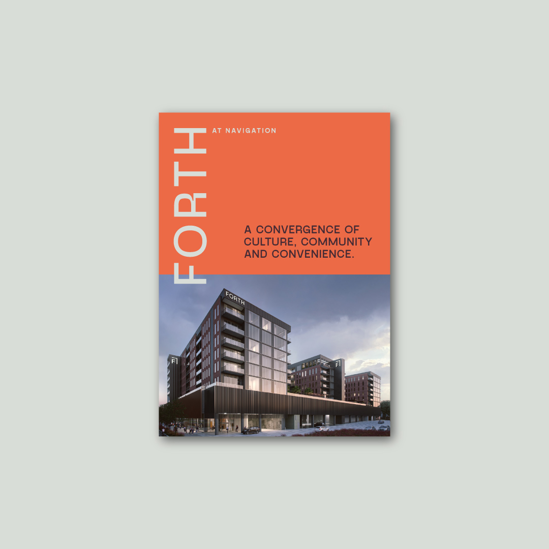
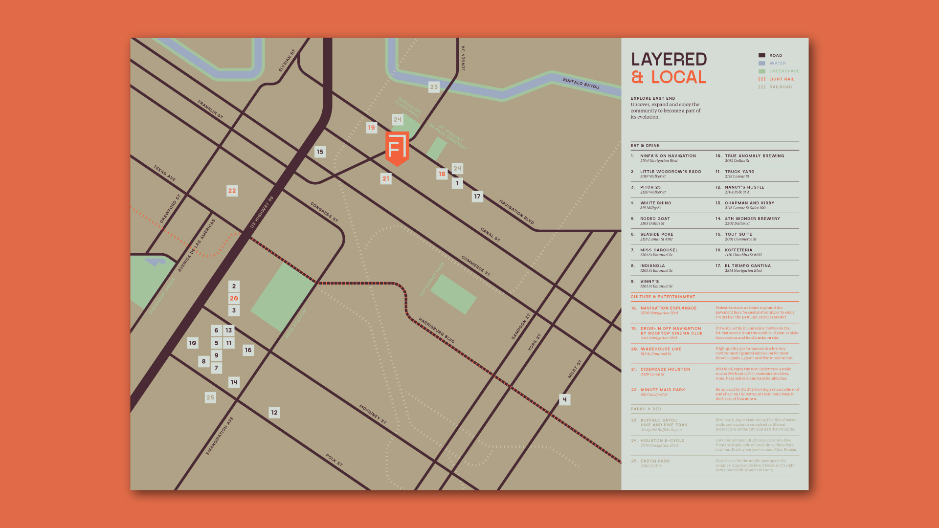
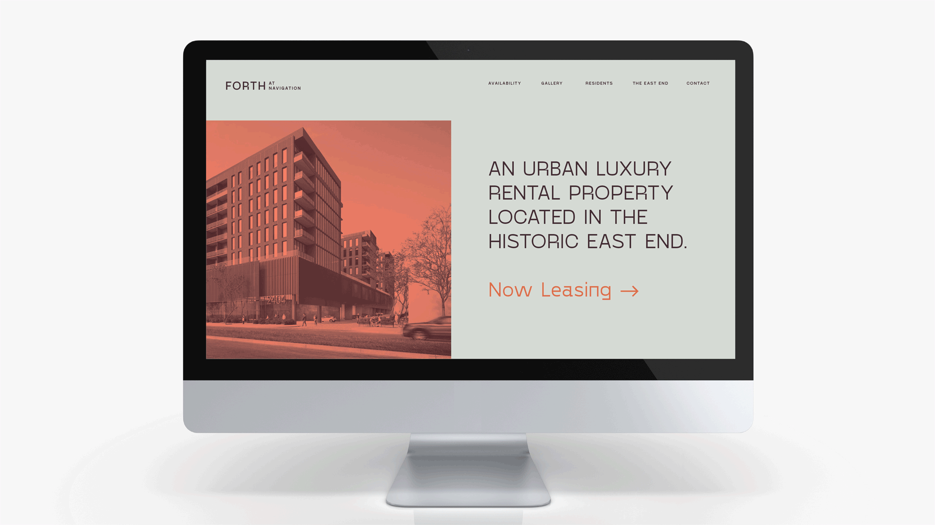
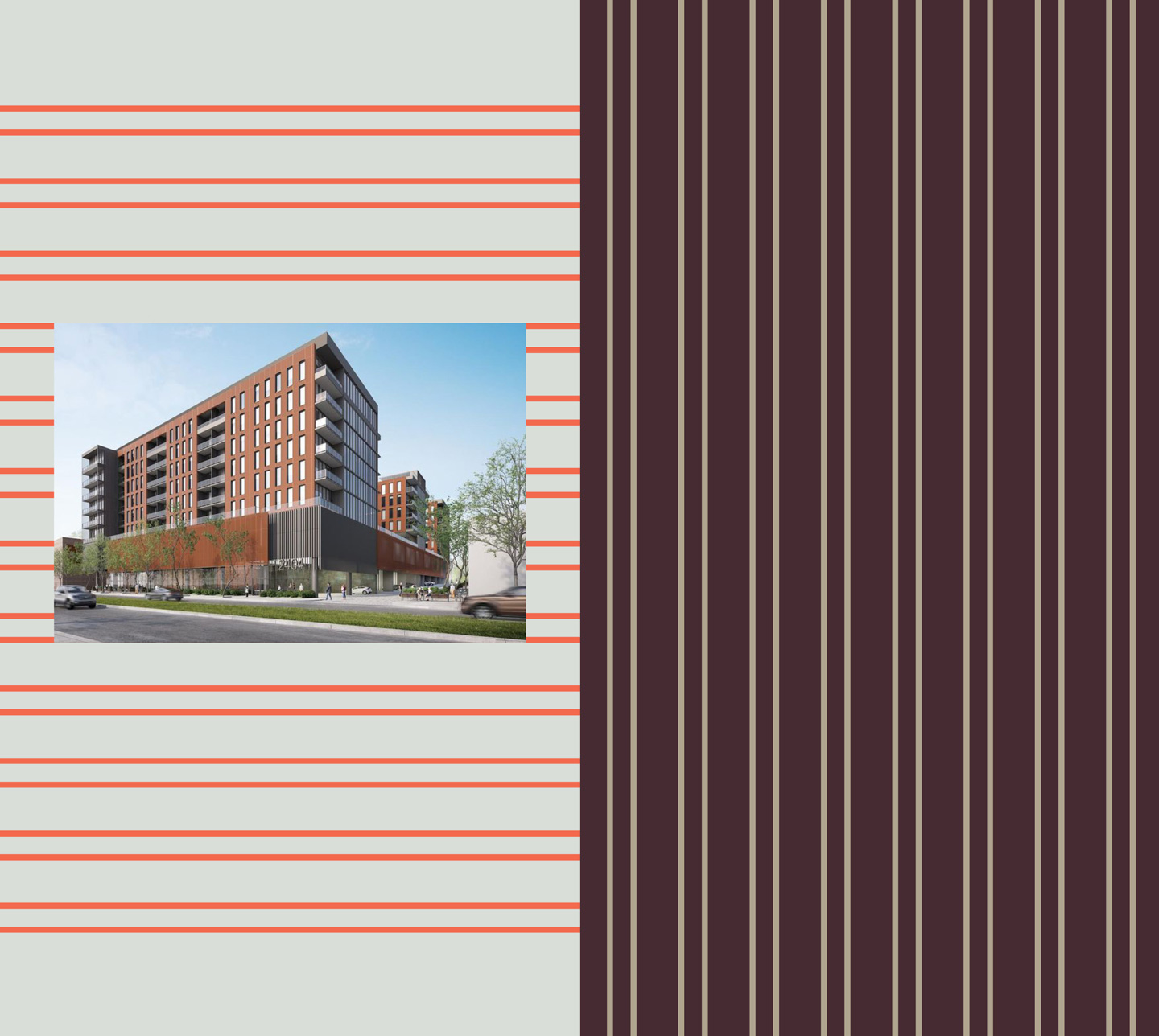
Forth at Navigation
See full project ↗
Forth at Navigation, a mixed-use development in Houston’s East End, celebrates the neighborhood’s industrial roots and progressive growth.
Collaborating with NUU Group, we developed a striking brand identity anchored by a distinctive corner-inspired logo system.
The design reflects the property’s unique location on Navigation Boulevard and its vision of fostering connection, progress, and community. Modular in its application, the identity seamlessly integrates into environmental graphics, print, and digital platforms, establishing Forth at Navigation as a cornerstone of the vibrant East End.


Houston Arts Alliance
See full project ↗
The Houston Arts Alliance (HAA) is a pivotal organization supporting Houston’s thriving arts community. We crafted a comprehensive brand identity to reflect HAA’s professionalism, transparency, and commitment to empowering artists and nonprofits.
The rebrand included a custom logo system, vibrant color palette, versatile typography, and modular design elements that celebrate HAA’s role as a cornerstone of the community. The identity was extended across various touchpoints, from signage and print materials to digital platforms, ensuring clarity and consistency in every interaction. This dynamic system underscores HAA’s mission to foster creativity and enrich Houston’s cultural fabric.


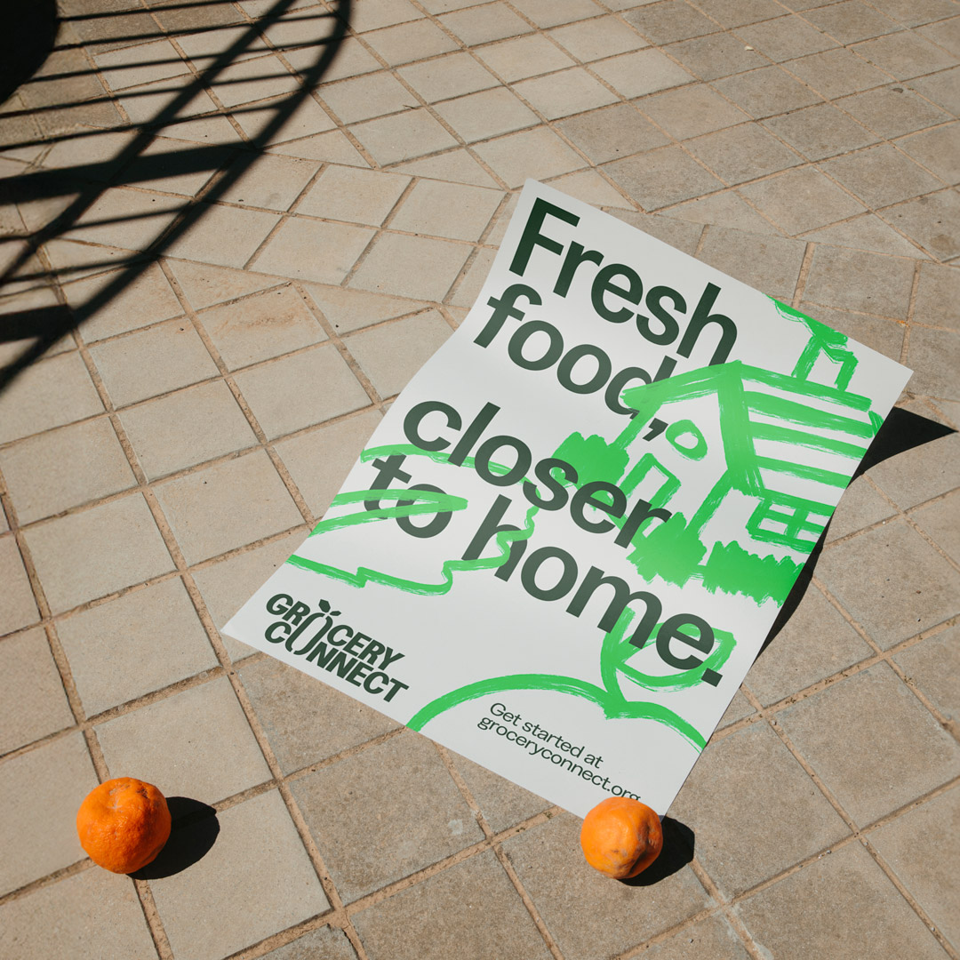
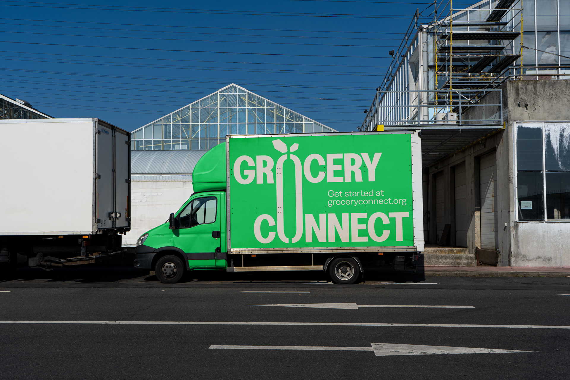
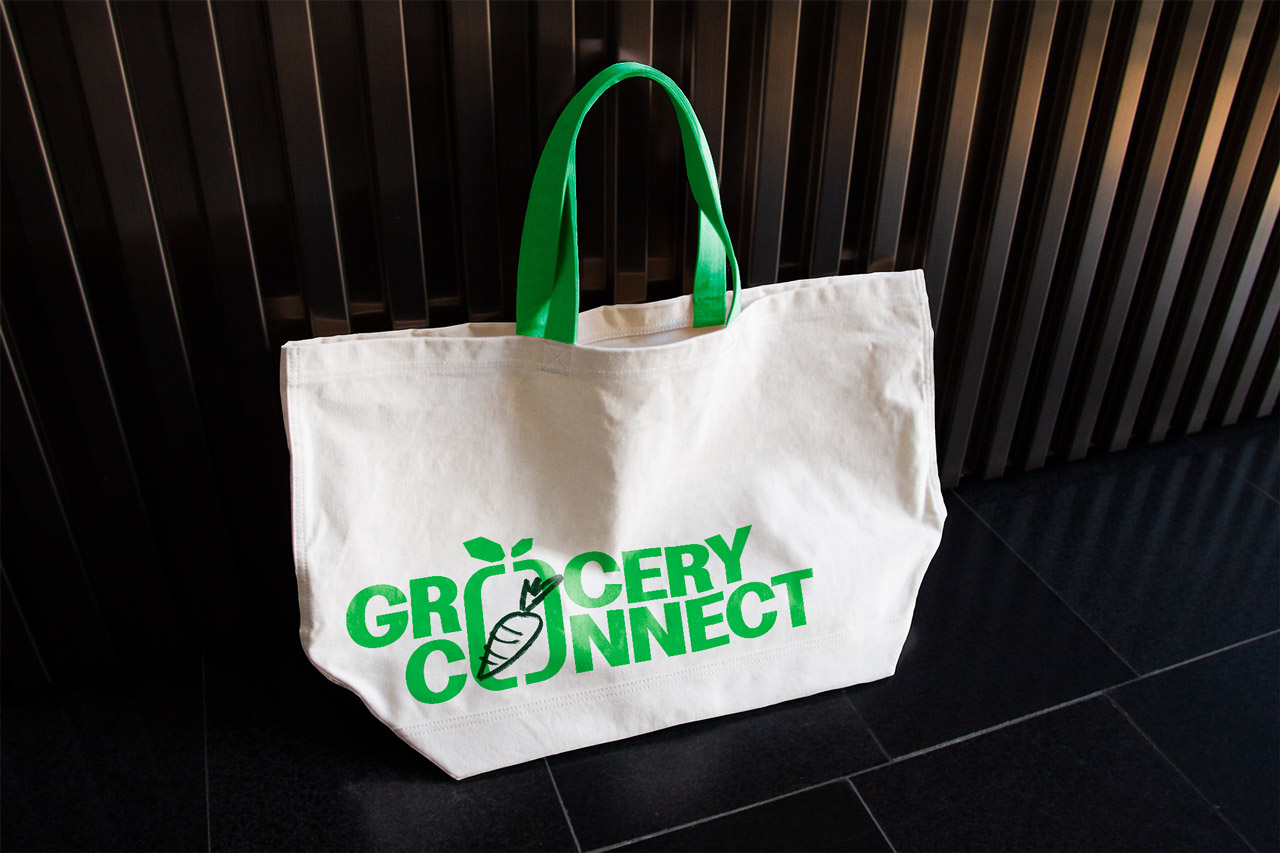
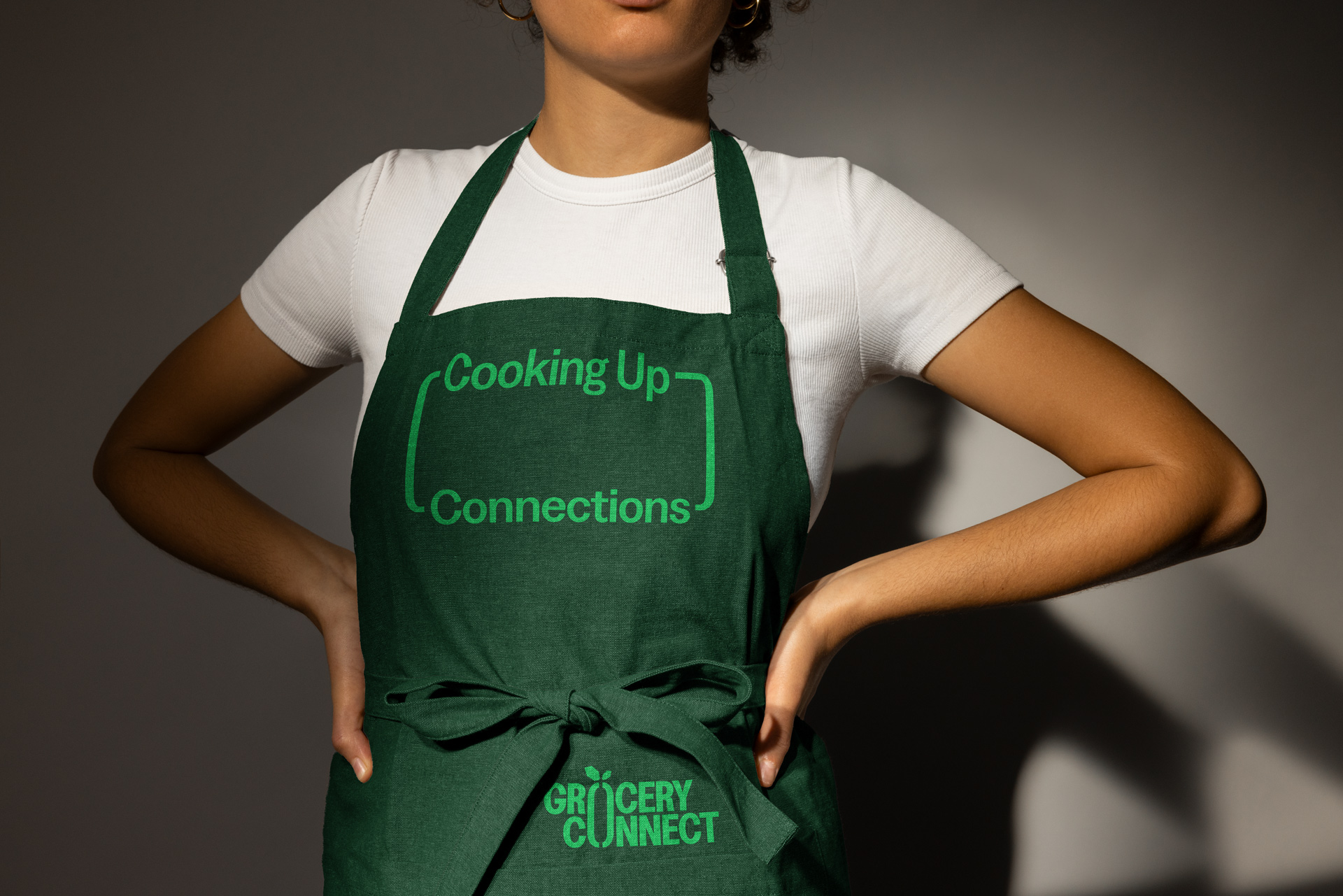
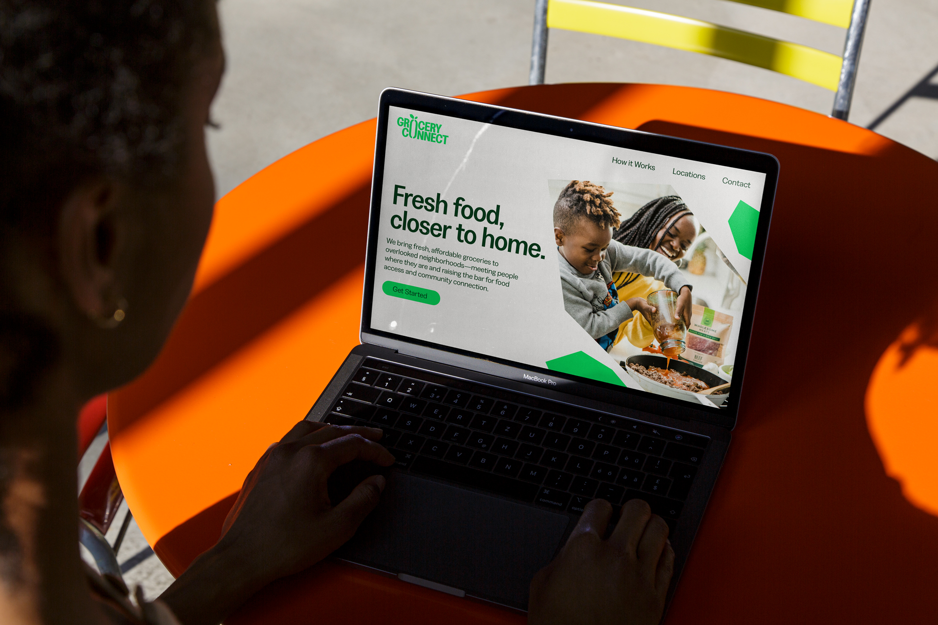
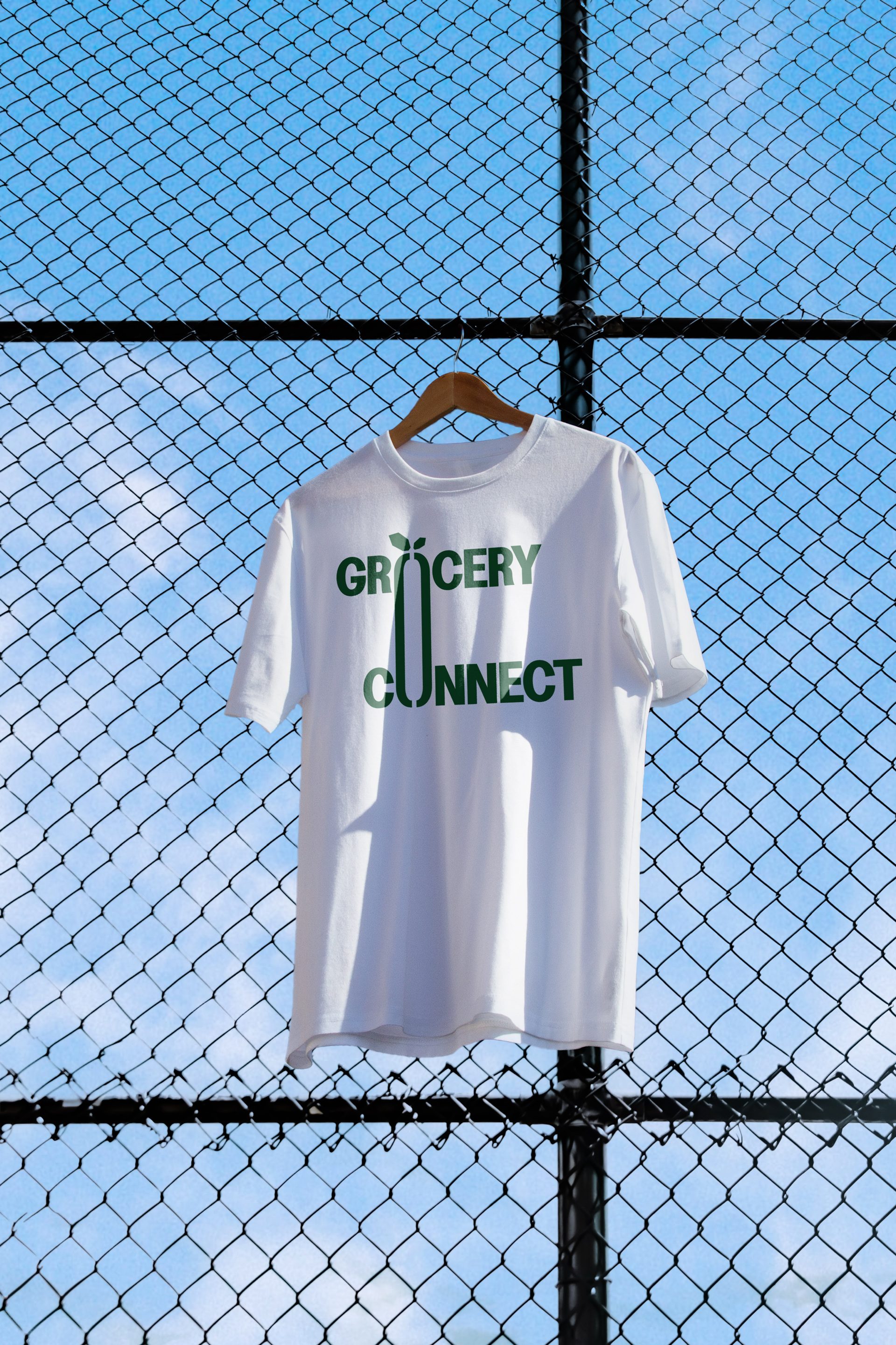
Grocery Connect
See full project ↗
Grocery Connect is a nonprofit initiative dedicated to filling the gap in access to healthy, affordable food in underserved communities in South Dallas, TX. Partnering with Kroger, they offer free grocery pick-up at their neighborhood centers.
We built a fresh identity and website focused on the ethos of connection and community, spanning expression through typography, illustration, and iconography. The result is a cohesive brand and digital foundation that helps Grocery Connect communicate its impact, build partnerships, and advocate for healthier neighborhoods.